Download and illustrate current and projected climate data in R
Current climate data, and projections how climate may change in the (near) future, are important for various reasons. For example, such data can be used to predict how habitat suitability for different animal and plant species or agricultural productivity changes over time.
Thus, in this post, I am showing how to get data on recent and projected climate directly into R, crop the obtained object to the area of interest (here: South America), and then calculate and illustrate the projected change. These data can then be used for further analyses in R.
The data are taken from worldclim.org, which provides climate projections from global climate models (GCM) following the Coupled Model Intercomparison Projects 5 (CMIP5) protocol. These models were used for the 5th report of the Intergovernmental Panel on Climate Change (IPCC) published in 2014. New models are currently developed following CMIP6, and will be used for the 6th IPCC report. I hope/guess that there will be soon an easy way to get these newer predictions into R (please leave a comment if you know about such a way).
For the GCMs, there are four representative concentration pathways (RCPs) describing different climate futures depending on the emitted volumes of greenhouse gases. I am using RCP 4.5 here, which assumes a peak decline in green house gases around 2040, followed by decreasing emission. This is a rather optimistic scenario.
Here are the different steps:
- Use the
getDatafunction from therasterpackage to get climate data into R. - Get a map of South America with the
rnaturalearthandsfpackages. - Crop the climate data to South America and calculate projected changes with the
starspackage. - Use the
ggplotandpatchworkpackages to illustrate the changes.
Some additional resources:
- Vignettes of the
starspackage - Vignettes of the
sfpackage - Online book on Geocomputation with R by Lovelace, Nowosad, and Muenchow
1. Get climate data with raster::getData
1.1 Prepare R
rm(list = ls())
library(stars)      # To process the raster data
library(sf)         # To work with vector data
library(ggplot2)    # For plotting
library(patchwork)  # To combine different ggplot plots
Additional packages that are used: raster (to get the climate data), rnaturalearth (to get the map of South America).
1.2 Get recent climate data
The getData function from the raster package makes it possible to easily download data on past, current/recent, and projected climate (and some other global geographic data sets. See ?raster::getData for details).
Here, I am downloading interpolations of observed data representative for the period 1960-1990 (it is also possible to get data for the period 1970-2000). To do so, I am using the following arguments:
name = 'worldclim'to download data from worldclim.org.var = 'bio'to get annual averages for all available climate variables. Other possibilities are, e.g., ‘tmin’ or ‘tmax’ for monthly minimum and maximum temperature.res = 10for the resolution of 10 minutes of degree. This downloads the global data set. For higher resolutions (e.g., 2.5), the tile(s) have to be specified (withlonandlat).pathspecifies that files are downloaded into subfolder ‘/blog_data’. For this dataset, the files ‘bio1.bil’ to ‘bio19.bil’ (plus ‘.hdr’ files) will be downloaded to ‘/blog_data/wc10/’.
file_path <- paste0(dirname(here::here()), "/blog_data/")
raster::getData(name = 'worldclim', var = 'bio', res = 10,
        path = file_path)
## class : RasterStack
## dimensions : 900, 2160, 1944000, 19 (nrow, ncol, ncell, nlayers)
## resolution : 0.1666667, 0.1666667 (x, y)
## extent : -180, 180, -60, 90 (xmin, xmax, ymin, ymax)
## crs : +proj=longlat +datum=WGS84 +ellps=WGS84 +towgs84=0,0,0
## names : bio1, bio2, bio3, bio4, bio5, bio6, bio7, bio8, bio9, bio10, bio11, bio12, bio13, bio14, bio15, ...
## min values : -269, 9, 8, 72, -59, -547, 53, -251, -450, -97, -488, 0, 0, 0, 0, ...
## max values : 314, 211, 95, 22673, 489, 258, 725, 375, 364, 380, 289, 9916, 2088, 652, 261, ...1.3 Get projected climate data
To get climate data projected for the period 2061-2080, I am using the following arguments:
name = 'CMIP5'to get data from the CMIP5 models.var = 'bio', which includes the same 19 variables for annual averages as for ‘worldclim’ (the set of variables other than ‘bio’ is very limited for ‘CMIP5’).res = 10as above.rcp = 45(see introduction)model = 'IP'(the ‘IPSL-CM5A-LR’ model). Check?raster::getDatafor a list of all models. Perhaps, downloading all/a subset of models and then average projections is better than using a single model, but for the sake of simplicity, I only download this single model here.year = 70to get projections for the period 2061-2080 (alternative is 50).pathas above. Files ‘ip45bi701.tif’- ‘ip45bi7019.tif’ will be downloaded to ‘/blog_data/cmip5/10m/’.
raster::getData(name = 'CMIP5', var = 'bio', res = 10,
        rcp = 45, model = 'IP', year = 70,
        path = file_path)
## class : RasterStack
## dimensions : 900, 2160, 1944000, 19 (nrow, ncol, ncell, nlayers)
## resolution : 0.1666667, 0.1666667 (x, y)
## extent : -180, 180, -60, 90 (xmin, xmax, ymin, ymax)
## crs : +proj=longlat +ellps=WGS84 +towgs84=0,0,0,0,0,0,0 +no_defs
## names : ip45bi701, ip45bi702, ip45bi703, ip45bi704, ip45bi705, ip45bi706, ip45bi707, ip45bi708, ip45bi709, ip45bi7010, ip45bi7011, ip45bi7012, ip45bi7013, ip45bi7014, ip45bi7015, ...
## min values : -227, -60, -80, 86, -22, -512, 53, -215, -421, -60, -455, 0, 0, 0, 0, ...
## max values : 344, 217, 94, 22678, 524, 283, 729, 415, 401, 421, 320, 10541, 2701, 489, 222, ...1.4 Load and process temperature data
The first variable from ‘bio’ is annual average temperature in 10 * °C. For recent data, the file name for this variable is ‘bio1.bil’, and for projected data ‘ip45bi701.tif’. Both can be loaded with the read_stars function from the stars package. Values have to be divided by 10 to get the temperature in °C (instead of 10 * °C)
annual_T <- stars::read_stars(paste0(file_path, "wc10/bio1.bil"))
annual_T <- annual_T/10
annual_T_70 <- stars::read_stars(paste0(file_path, "cmip5/10m/ip45bi701.tif"))
annual_T_70 <- annual_T_70/10
1.5 Quick Plots
For the plots, I am defining a color palette for temperature. Colors are taken from the “5-class RdYlBu” palette from http://colorbrewer2.org.
# The result, temp_colors, is a function with argument n for the number of
# colors.
temp_colors <- colorRampPalette(c("#2c7bb6", "#abd9e9", "#ffffbf", "#fdae61", "#d7191c"))
Then, global maps can be plotted with this color palette:
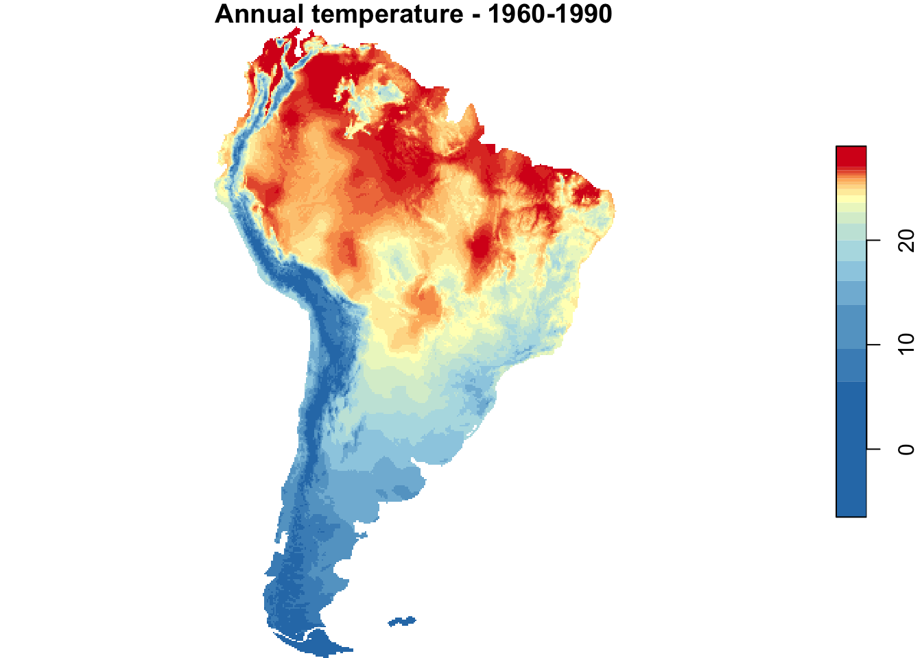
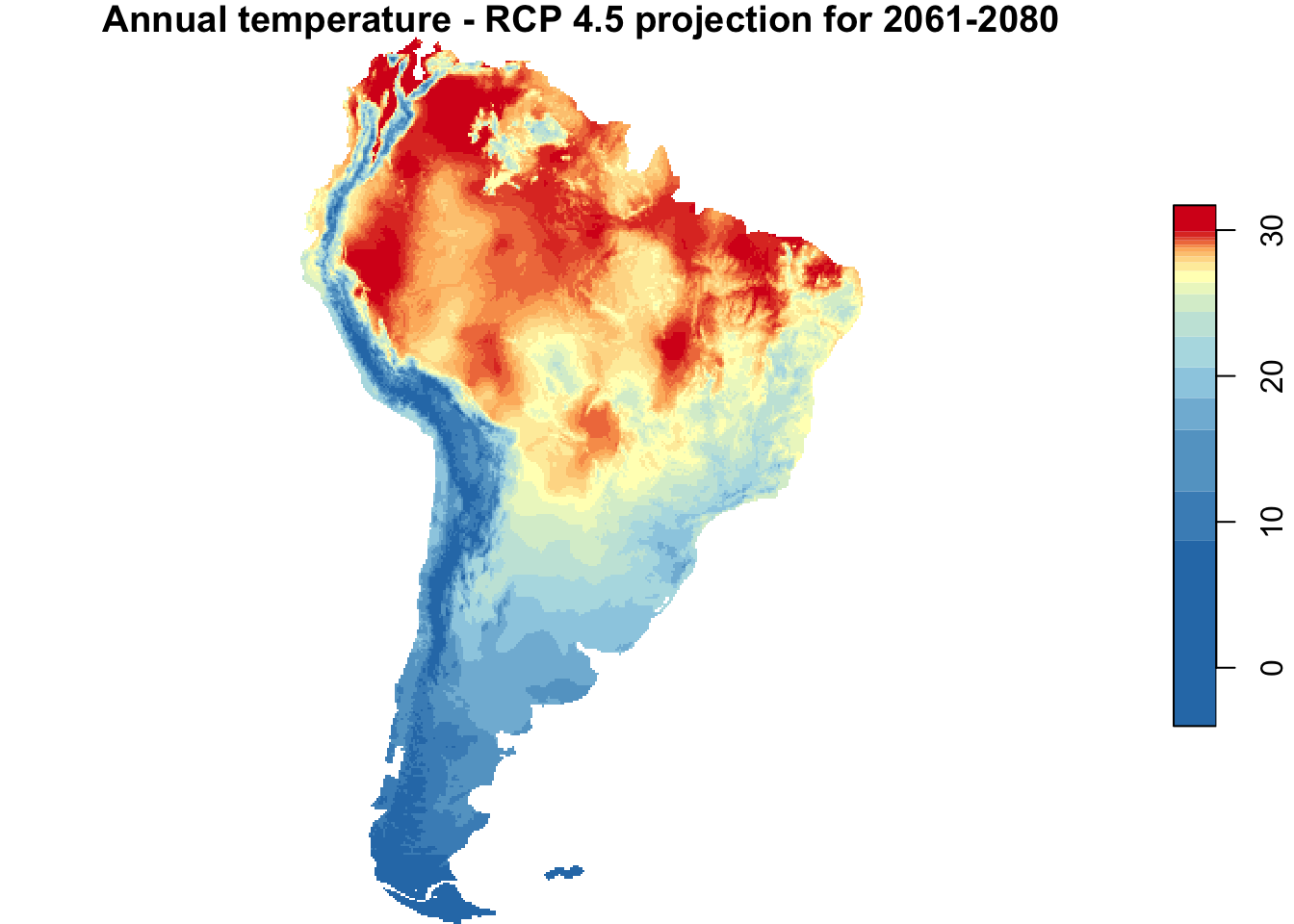
nbreaks <- 20
{
  par(mfrow = c(1,2))
  plot(annual_T, main = "Annual temperature - 1960-1990",
     nbreaks = nbreaks,
     col = temp_colors(nbreaks - 1))
  plot(annual_T_70, main = "Annual temperature - RCP 4.5 projection for 2061-2080",
     nbreaks = nbreaks,
     col = temp_colors(nbreaks - 1))
}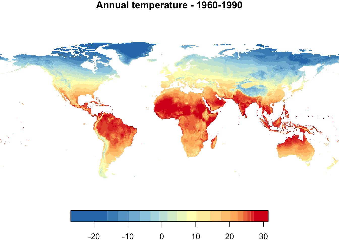
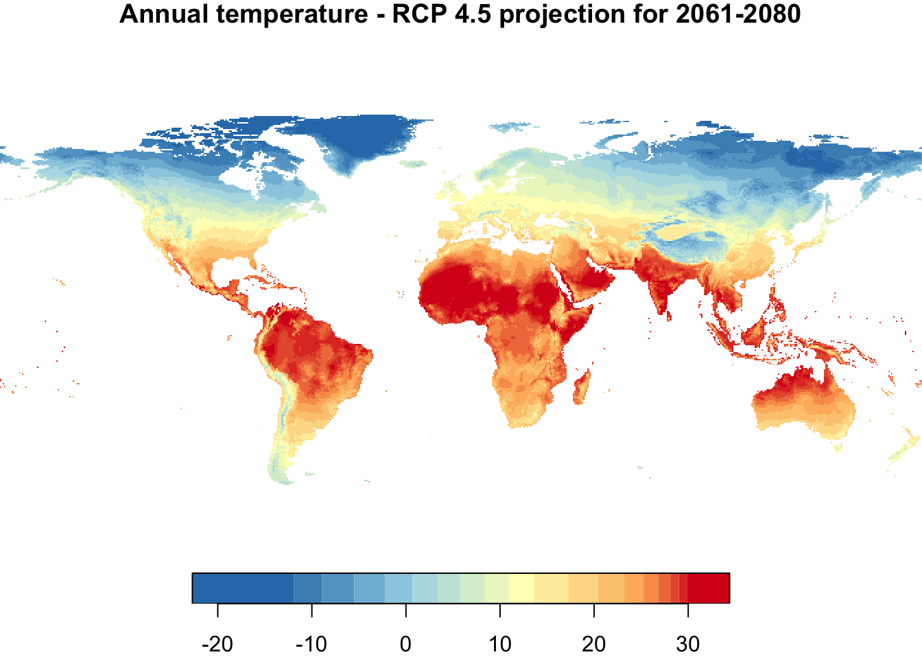
Colors are not directly comparable between the two maps! The temperature range of each data set is used to define the color range for each map. Thus, in each map, the bluest color indicates the coolest temperature and the reddest color the hottest temperature, which differ between the two maps. This will be fixed in the plot below.
2. Get Map of South America
Get all countries from South America with the rnaturalearth package, and then combine them to a single shape.
south_america_map <- rnaturalearth::ne_countries(continent = "south america", returnclass = "sf")
# The precision has to be set to a value > 0 to resolve internal boundaries.
st_precision(south_america_map) <- 1e9 # Required to
south_america_map <- st_union(south_america_map)

{
par(mar = c(0,0,0,0))
plot(south_america_map)
}
3. Climate of South America
3.1 Crop climate raster data to area of South America
To crop a raster with the stars package, square brackets [] will work as crop operator (see here for details).
annual_T_SA <- annual_T[south_america_map]
# CRS for projected T and south america map are the same (EPSG 4326) but the
# proj4string includes more details for annual_T_70. Thus, they have to
# be made identical before cropping.
st_crs(annual_T_70) <- st_crs(south_america_map)
annual_T_70_SA <- annual_T_70[south_america_map]
Quick plots:
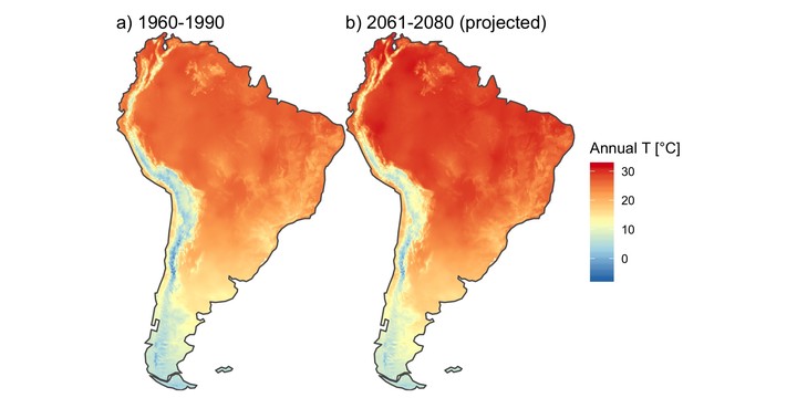
{
  par(mfrow = c(1, 2))
  plot(annual_T_SA, main = "Annual temperature - 1960-1990",
       nbreaks = nbreaks,
       col = temp_colors(nbreaks - 1))
  plot(main = "Annual temperature - RCP 4.5 projection for 2061-2080",
       annual_T_70_SA, nbreaks = nbreaks,
       col = temp_colors(nbreaks - 1))
}
3.2 Get some basic summaries
The print method for stars objects provides some summary statistics, such as max, min, or median temperature.
annual_T_SA## stars object with 2 dimensions and 1 attribute
## attribute(s):
## bio1.bil
## Min. :-6.50
## 1st Qu.:17.60
## Median :24.00
## Mean :21.03
## 3rd Qu.:26.00
## Max. :29.00
## NA's :59262
## dimension(s):
## from to offset delta refsys point values
## x 592 872 -180 0.166667 +proj=longlat +datum=WGS8... NA NULL [x]
## y 466 874 90 -0.166667 +proj=longlat +datum=WGS8... NA NULL [y]But these values can also be manually calculated. For example, the mean temperature in South America for the period 1960 - 1990 is:
mean(annual_T$bio1.bil, na.rm = T)## [1] 8.144672Currently, bio1.bil is the only attribute (i.e., the variable with recent annual temperature) in the annual_T object, but stars objects can also include several attributes.
Here, I will rename this attribute to recent. Then I will add the projected temperature from the other object (annual_T_70_SA$ip45bi701.tif) as a second attribute projected. Finally, I will calculate the difference between the two, which is the projected change.
names(annual_T_SA) <- "recent"
annual_T_SA$projected <- annual_T_70_SA$ip45bi701.tif
annual_T_SA$change <- annual_T_SA$projected  - annual_T_SA$recent
annual_T_SA
## stars object with 2 dimensions and 3 attributes
## attribute(s):
## recent projected change
## Min. :-6.50 Min. :-4.00 Min. :1.00
## 1st Qu.:17.60 1st Qu.:20.10 1st Qu.:2.50
## Median :24.00 Median :26.80 Median :2.80
## Mean :21.03 Mean :23.76 Mean :2.73
## 3rd Qu.:26.00 3rd Qu.:28.80 3rd Qu.:3.00
## Max. :29.00 Max. :31.70 Max. :4.40
## NA's :59262 NA's :59262 NA's :59262
## dimension(s):
## from to offset delta refsys point values
## x 592 872 -180 0.166667 +proj=longlat +datum=WGS8... NA NULL [x]
## y 466 874 90 -0.166667 +proj=longlat +datum=WGS8... NA NULL [y]4. Illustrate changes in temperature with ggplot and patchwork
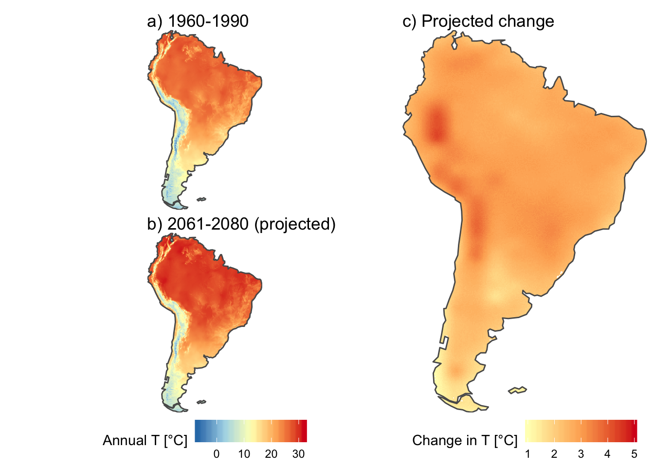
Here, we can use scale_fill_gradientn to define temperature colors, and then use the same limits for both plots. Now, colors are directly comparable between the plots for annual temperature. I will only use red colors for the change in temperature, as these values are always positive.
recent_T_plot <- ggplot() +
  geom_stars(data = annual_T_SA) +
  scale_fill_gradientn(name = "Annual T [°C]",
                       colors = temp_colors(5),
                       limits = c(-7, 32),
                       na.value = "white") +
  geom_sf(data = south_america_map, fill = NA) +
  scale_x_discrete(expand = c(0, 0)) +
  scale_y_discrete(expand = c(0, 0)) +
  ggtitle("a) 1960-1990") +
  theme_void() +
  theme(legend.position = "none")

projected_T_plot <- ggplot() +
  geom_stars(data = annual_T_SA["projected"]) +
  scale_fill_gradientn(name = "Annual T [°C]",
                       colors = temp_colors(5),
                       limits = c(-7, 32),
                       na.value = "white") +
  geom_sf(data = south_america_map, fill = NA) +
  scale_x_discrete(expand = c(0, 0)) +
  scale_y_discrete(expand = c(0, 0)) +
  ggtitle("b) 2061-2080 (projected)") +
  theme_void() +
  theme(legend.position = "bottom")

projected_change_T_plot <- ggplot() +
  geom_stars(data = annual_T_SA["change"]) +
  scale_fill_gradientn(name = "Change in T [°C]",
                       colors = temp_colors(5)[3:5],
                       limits = c(1, 5),
                       na.value = "white") +
  geom_sf(data = south_america_map, fill = NA) +
  scale_x_discrete(expand = c(0, 0)) +
  scale_y_discrete(expand = c(0, 0)) +
  ggtitle("c) Projected change") +
  theme_void() +
  theme(legend.position = "bottom")
Finally, I will combine the three maps with the patchwork package (see here for details).
(recent_T_plot / projected_T_plot + plot_layout(guides = "keep")) | projected_change_T_plot +
  theme(plot.margin = margin(c(0, 0, 0, 0)))